Review of album - Nehruviandoom.
In 2014 the long awaited collaboration between the Hip Hop legend MF doom and the upcoming talent that is Bishop Nehru was released, Nehruviandoom was a huge success on the underground Hip Hop scene due to the build up that was created from Dooms previous success with albums such as Operation Doomsday and Madvillain. Furthermore Bishop Nehru has amassed quite a reputation for an up and coming rapper with massive potential, this may have been what drew Doom towards this collaboration. The album has a variety of different beats to the songs with tracks such as 'OM' and 'Darkness' featuring Dooms classic slow guitar riffs and deep tones for the chorus with Bishops higher beat rapping over the top, this mixture works really well and creates an almost father/son relationship between the two rappers. Moreover songs such as 'Mean the most' illustrate how Bishop Nehru stands out from other rappers of the same genre, Bishops flow and lyrical content gives him a maturity beyond his years.
Wednesday 28 January 2015
Tuesday 27 January 2015
Monday 26 January 2015
Friday 23 January 2015
Tuesday 20 January 2015
Updates
Work I have completed:
- Title decision
- Audience profile
- Fashion associated with my genre
- Analysis of magazine titles
- Style of magazine
- Language register
- Front page analysis
- Contents page analysis
- Double paged spread analysis
- Examples of other text
- Prelim magazine front cover
- Prelim magazine contents
- 25 word pitch
- Playlist
Work I haven't completed:
- Colour Pallets
- Audience research (UK tribes)
- Photographer/Magazine creator/ Graphic designer
- Comment on peers blog
- Mood board
- Institute to publish my magazine
Organisation and time management - I felt that I spent too long on the preliminary magazine front cover and contents page task and not enough on the rest of my work, furthermore we didn't take our photos till the 3rd lesson which slowed us down quite a bit.
Research and planning - Through research of this industry I have learnt the amount of effort that goes into it, furthermore how time consuming it is.
Technology - For the preliminary task of designing the magazine cover and contents page I used photoshop to design and edit it. Moreover I used a camera to take the photos which didn't require a lot of effort however the use of lighting and the white screen behind required setting up.
Sunday 18 January 2015
Title Decision
After lots of thought on what name would be an appropriate masthead for my Hip Hop inspired magazine I have settled on Levels. This I believe reflects what I am trying to achieve with my magazine as I intend to incorporate various levels of Hip Hop from those who already have world fame down to the urban underground Hip Hop scene which have not been unearthed to the mainstream public. I chose this name because I believe it to be short and catchy enough for it to stick in the readers mind without it being easy to forget. Moreover it isn't a too bigger word in that people will struggle to pronounce it or be put off by its complicated vocabulary when picking it off a shelf.
Audience profile
Name: Tom
Age: 18
Occupation: Tom is currently studying for his A-Levels in Media, English, Geography and Drama, his understanding of the English language would allow him to relate to what i'm writing in my magazine and interpret the meaning of various terms and the English vocabulary.
Interests: Tom enjoys listening to Hip Hop in his spare time where he can relax and forget about college, he enjoys listening by himself but also with friends so they can share opinions on various artists. Fashion (and in particular streetwear) play a large part in his life as he enjoys buying and wearing various items from the streetwear scene, you'll often see tom sporting designer clothing such as Nike, Undefeated and Supreme.
Favourite music: MF doom, Bishop Nehru, Yung Lean, The Notorious B.I.G.
Favourite Magazine: Vice, Respect, XXL.
Favourite Places: House partys, clubs and Hip Hop concerts.
Favourite activities: Shopping, Socialising, Partying.
Fashion associated with my Genre of Music
The clothing often associated with the Hip Hop genre/scene would be more commonly referred to as 'Street wear'. This is generally expensive brands which owning an item of raises the the individual status above those around them and are often limited or even deadstock so are difficult for 'normal' people to get there hands on without spending a large amount of money. The brands commonly associated with these items of clothing would be A Bathing Ape, Supreme, Nike, The North Face etc. However brands which would have often been often associated with the upper class such as Ralph Lauren, Tommy Hilfiger and Raf Simons have recently begin to be more commonly worn on the street scene. The stereotypical image of a Hip Hop artist would often feature a large fur coat, jewellery and diamonds which often feature prominently within the hierarchy if the Hip Hop culture.


Double paged spread Wiz
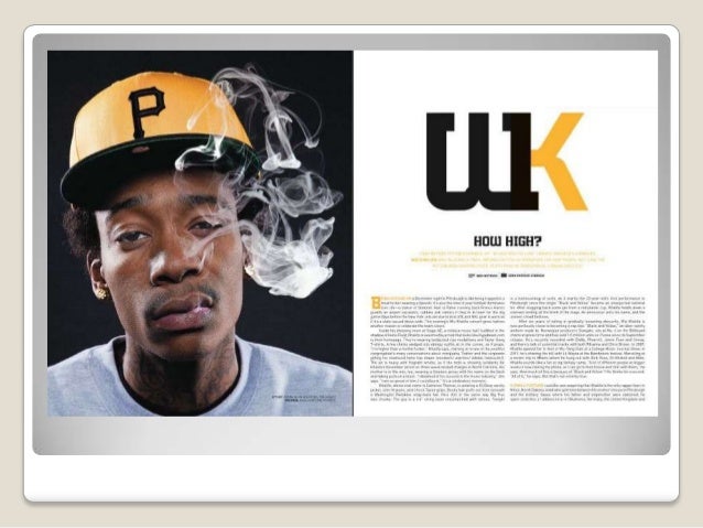
I chose this double paged spread due to the fact I like the look and design of it, the cap worn by the rapper Wiz Khalifa matches the gold/black colour pallet which runs throughout this article. The main cover line has been cleverly edited from 'UK' to 'WK' using a bold black font which immediately suggests to the reader that the purpose of this article is to talk about the affect that his music has had on the UK rap scene. Furthermore the words 'HOW HIGH?' are printed as a subtitle underneath which links with the stereotype that all rappers smoke Marijuana and that he featured in the film 'How High?' with Snoop Dogg, this is a deliberate tactic to obtain the readers interest. In addition the text used is all in standard font, apart from an oversized gold 'B' at the beginning which is used to intrigue the reader into reading the smaller text.
Double paged spread Rick

I picked this double page spread to analyse as I liked the main image that is a full body shot of the rapper Rick Ross, the way that he is dressed and the clutching of a (presumably expensive) bottle of champagne suggests that he has made it as an artist. Similarly this image links with the main title which states 'MAN MADE' in bold black font with a reversed reflection beneath. The colour pallet of this spread is completely black and white which again gives it an almost 'classy' look about it. The text that features is all in black with an oversized 'T' beginning the paragraph which is eye catching for the reader. Underneath the title 'Rick Ross' is printed in bold to announce the artist to the reader.
Double paged spread analysis Lupe

I like the colour pallet in this double page spread as the gold and white colours connote class and power which is something in which the Hip Hop artist Lupe Fiasco has succeeded in on the Hip Hop industry. Moreover the inclusion of two pictures with a main image and a picture of him performing means the article does not look boring aesthetically, the clothing in which he is dressed in with the hoodie and gold watch are common links with the Hip Hop genre. Furthermore the text is all written in white or gold to stick with the colour scheme, words such as 'struggle', 'God loves' and 'Humble' are all written in white enlarged writing to draw the readers attention to what he had to say. Similarly 'FIASCO' is written in bold gold as the main line of the text, this is to attract any possible fans of his music to read the magazine/article.
Contents page analysis Usher

I enjoyed the layout of this piece with the oversized mid shot of the artist Usher with the contents down the side, the style in which he is dressed such as the inclusion of fur on his coat all have links to the Hip hop genre. I like the neat layout of the text in this contents page with the colour pallet being all grey, white and black which you can associate with the serious pose of the artist. In addition the masthead is small however placed in a position in which the reader would still acknowledge it, the positioning is important as it may cause the reader to remain interested or not. Overall I may choose to include elements of this in my own contents page as I like the precise look of it.
Contents page analysis 50 Cent
For this contents page I liked the use of the mid shot of the Hip Hop artist 50 Cent which was placed down the left hand side of the page with the 'features' on the opposite side. This is something I may consider using during my own contents page. Moreover the colour pallet in this particular page is collaboration of red, white and black which again is a colour set often associated with this genre of music. The features are all written in small black font which I personally would change as I believe it gives it a monotonous look and would not grasp the readers attention. Furthermore the masthead of this piece is not very eye catching for the reader which is something which would be important for the reader to remain interested.
Contents page analysis Kanye
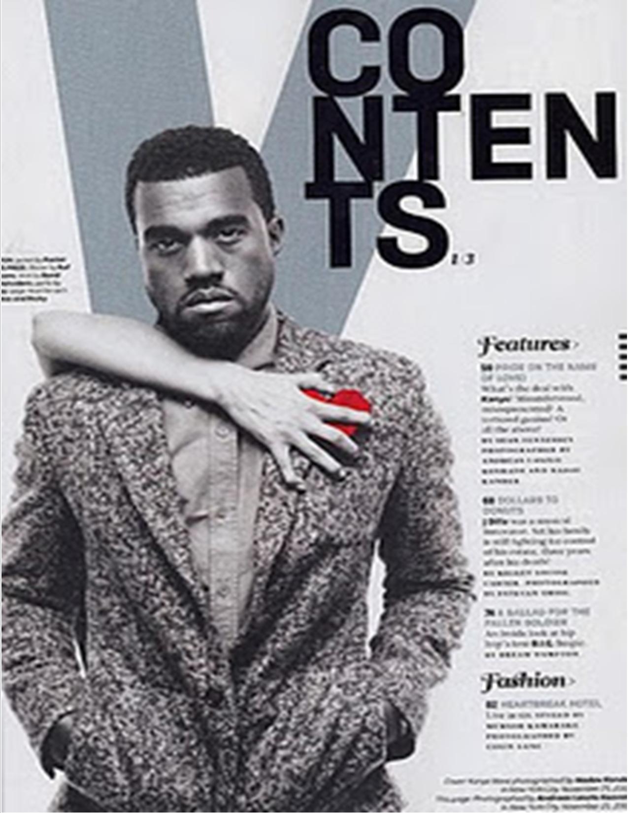
In this contents page the use of the black and grey colour scheme works really well as it links with 'moody' nature of the Hip hop artist Kanye West, moreover the splash of colour on his heart which is clutched by what seems to be a womens hand has various connotations about his life. Another feature of this page which I liked was the giant 'V' behind the main picture to subtly remind the reader of the magazine in which they are reading. The masthead and text all stick with serious mood of this piece by the use of grey and black and I believe this to give this a balanced look to it.
Friday 16 January 2015
Analysis of magazine titles
The initials NME stand for 'New musical express', this is largely due to it often featuring bands who are relatively unknown to the public. The use of the red font with the black and white outline is deliberate as it is eyecatching to the reader. Moreover the use of the short 3 letters allows for a large masthead which would stick in the readers mind.
The term 'VIBE' is often associated with enjoying or relaxing to the sound of music, often which includes a beat which again is associated with the Hip Hop genre. The black bold writing gives off a Hip Hop feel to it which is something I'm going to consider in my magazine's masthead. One minor problem for the colour scheme is that the mastheads colour is changed to represent each different colour of the magazine, this is something I may have to consider as it would not make the masthead easy to recognise.
I intend to include elements of the simplicity of this logo in my masthead, the basic red, white and black shadow make it stand out and easy to recognise even when this colour pallet is often used with magazine of this genre. Furthermore the lack of text aside from the 'Q' will allow for maximum size of the masthead to grasp the publics attention.
Style of magazine
After thoroughly researching the different genres for my magazine I have settled on Hip Hop, I considered using Indie Rock however I felt that through using a different genre to the generic Kasabian etc I would be able to be more creative with my final piece. Since considering possible style models for my magazine I have settled on using 'Levels' as this generally represents Hip Hop artists and would allow me to use elements of its design when considering my final piece. Another reason for me choosing to use Hip Hop to alternatives was that I listen to a lot of this genre of music and feel I could use this knowledge to good effect in my magazine. Moreover the clothing styles and setting in which I will take my pictures will be good to experiment with.
Language Register
The type of target audience in which a magazine is catering towards will affect if they choose to be formal or informal register, even if the genre of music they have is the same as others. An example of an informal magazine aimed at younger people/teenagers would be 'NME', this includes lots of slang words and youth dialect that older people may not understand or be able to relate to. Furthermore an example of a more hip hop orientated magazine would be 'Vibe', this similarly to the 'NME' magazine includes lots of slang and modern day jargon which is often associated with the hip hop culture. On the other hand, an example of a formal magazine which target market is adults would be 'Q' magazine, this would often appeal to those who are interested in music which pre-dates more modern music and would include bands such as Oasis. For my magazine I intend to do an informal hip hop piece aimed at teenagers through to early twenty's, this would include a variation of artists from The Notorious B.I.G to MF DOOM.
Thursday 15 January 2015
Wednesday 14 January 2015
Magazine cover analysis
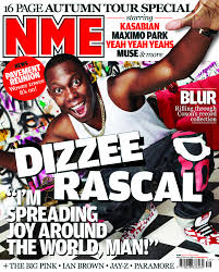
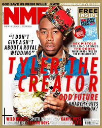
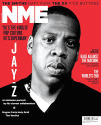
I chose these 3 examples as they all represent (possibly with the exception of Tyler, the creator) the genre hip hop, I am hoping to use this type of music to represent in my magazine. I'm thinking of taking influence from these kind of magazines and using the red, white and black colour scheme. Moreover I liked the use of the bold print to announce the artist to the reader and the informal quote about/by the musician as I felt this plays a large factor in drawing in the reader.
Examples of other text
The NME magazine featuring Ian Brown and Jay-Z i chose because i thought it included a good colour scheme and use of various texts sizes. Furthermore the positioning of the two celebrities on the front cover are proportionally correct.
Another cover i chose was the NehruvianDoom album cover as i believe that the almost 'cartoon' aspect of the cover draws in the reader to the finer details on the cover, certain parts of this imay choose to include in my magazine. Moreover i like the 'alternative' look to a classic hip hop album which commonly include monotonous black and grey colours.
Additionally I chose the Rolling stone magazine featuring The Notorious B.I.G due to the fact that I like the colour scheme of red, white and black as these colours compliment eachother well.
Tuesday 13 January 2015
Subscribe to:
Posts (Atom)

